User Interface Well Care
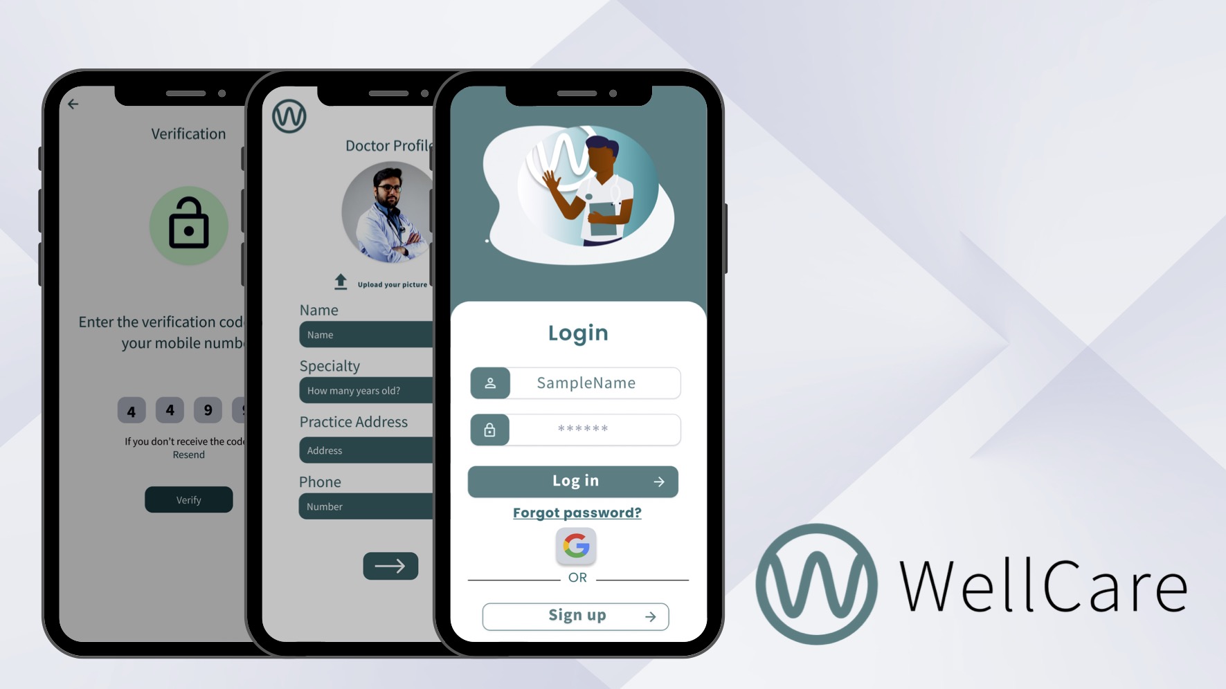
This is a review of the user interface for a healthcare app I designed called WellCare. The goal was to further study the purpose of graphic elements and their purpose to the user in a healthcare application by creating, analyzing, and researching how to create the user flow and the visual purpose elements served. This is an ongoing project.
The Goal
Create the user interface for a healthcare app for patients and doctors to manage appointments, communication and schedules.

Color
- I initially selected a shade of blue that did not pass AA standards of contrast against a white background when tested against the WCAG (Web Content Accessibility Guidelines.)
- I adjusted my initial shade to increase the ratio of contrast for the primary color and adjusted the additional color pallet so that it would be AA passing.
Additionally, I utilized Google’s Material Design system to establish colors for elevation and depth in a harmonious palette.
Why Blue for Healthcare?
According to https://www.colorpsychology.org/blue/ blue is a color widely used in healthcare due to studies showing associations of trust, calmness, and trustworthiness.
- “Blue is an appealing color in marketing and branding due to its positive associations of dependability, trust, confidence, and competence. However, blue logos lack differentiation if overused.
- Studies show that the color blue can have calming effects on the brain and body. It causes the brain to release serotonin, which regulates mood, appetite, and sleep.”
Fonts & Icons
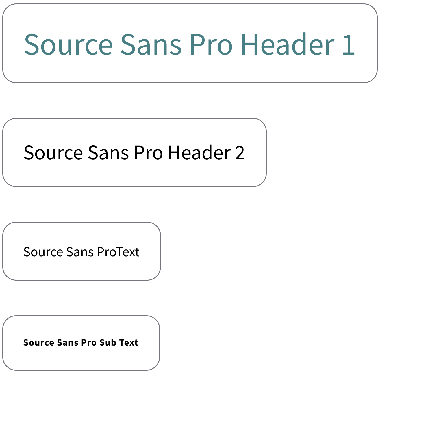
The logo was created in the primary color using Source Sans Pro. This font is clear, professional, and multilingual. It enhances the app’s user interface with a versatile and reliable font that ensures readability, conveys professionalism, supports various languages, and offers design flexibility.


Color
- I initially selected a shade of blue that did not pass AA standards of contrast against a white background when tested against the WCAG (Web Content Accessibility Guidelines.)
- I adjusted my initial shade to increase the ratio of contrast for the primary color and adjusted the additional color pallet so that it would be AA passing.
Additionally, I utilized Google’s Material Design system to establish colors for elevation and depth in a harmonious palette.
Why Blue for Healthcare?
According to https://www.colorpsychology.org/blue/ blue is a color widely used in healthcare due to studies showing associations of trust, calmness, and trustworthiness.
“• Blue is an appealing color in marketing and branding due to its positive associations of dependability, trust, confidence, and competence. However, blue logos lack differentiation if overused.
• Studies show that the color blue can have calming effects on the brain and body. It causes the brain to release serotonin, which regulates mood, appetite, and sleep.”
Fonts & Icons

The logo was created in the primary color using Source Sans Pro. This font is clear, professional, and multilingual. It enhances the app’s user interface with a versatile and reliable font that ensures readability, conveys professionalism, supports various languages, and offers design flexibility.


![]()
Different tones of blue were used on different backgrounds to create a sense of hierarchy for the user. In the sample, the arrow is light blue while the logout font is white demonstrating that the text is more prominent than the arrow while still maintaining contrast for visibility.

![]()
Different tones of blue were used on different backgrounds to create a sense of hierarchy for the user. In the sample, the arrow is light blue while the logout font is white demonstrating that the text is more prominent than the arrow while still maintaining contrast for visibility.
Log In

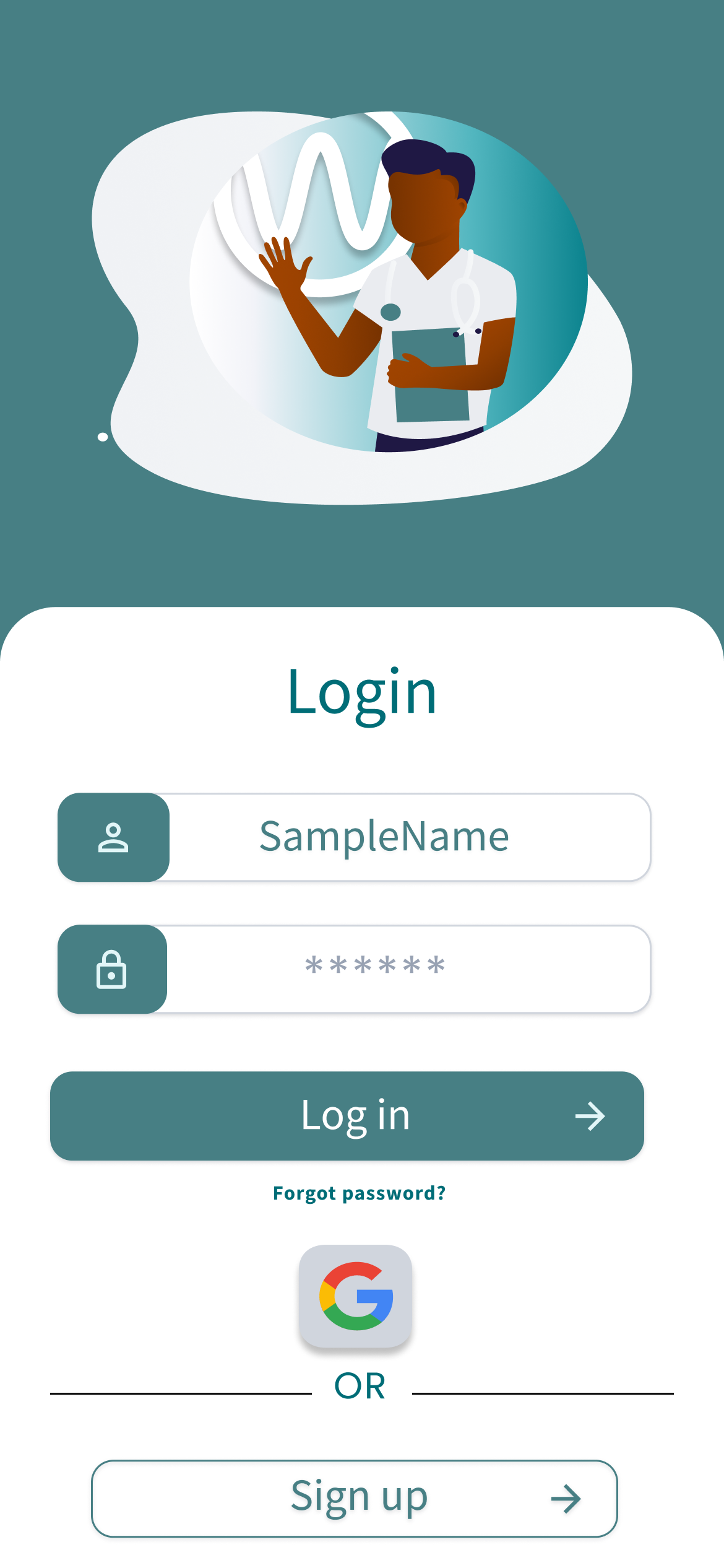
Branding and Logo: Including the app’s branding elements and logo on the home screen reinforces brand recognition and establishes trust. It helps users associate the app with the healthcare provider or organization they are familiar with.
Simplified Login Process: Google Sign-In allows users to log in to the app using their existing Google credentials. By offering this option on the home screen, you offer multiple options for the users reducing friction in the login process.
Password Recovery/Forgot Password: Providing a password recovery or “Forgot Password” option helps users regain access to their accounts in case they forget their login credentials. It demonstrates the app’s commitment to security and user support.
Call to Action: Including a clear call-to-action button, such as “Login” directs users towards the next step. It helps streamline the login process and encourages users to take action without confusion.
When designing the home screen of a healthcare login app, the focus should be on simplicity, usability, and maintaining a secure environment. The chosen UI elements aim to streamline the login process, provide reassurance regarding data security, and create an intuitive and visually appealing user experience.
Visual Hierarchy: Establishing a clear visual hierarchy by using size, color, and placement of elements helps guide users’ attention. Prioritize essential elements like the login form and calls to action to make them more prominent and easily noticeable.
Clear Instructions: Providing concise and intuitive instructions or labels next to input fields, such as “Enter your username” or “Password,” reduces user confusion and improves the login experience.
Doctor and Patient Profile

The users choose if they are a doctor or patient during the registration process to tailor the app experience and provide personalized features based on their role. Here are some key user interface reasons for incorporating this choice:
1. Relevant Content and Features: Differentiating between doctors and patients allows the app to present relevant content and features to each user group. By understanding their role, the UI can adapt and provide specialized functionalities that meet the specific needs and workflows of doctors or patients.
2. Customized User Experience: Designing separate interfaces based on the user’s role enables a customized user experience. Doctors may require access to patient records, medical history, or advanced clinical tools, while patients may prioritize appointment scheduling, health tracking, or communication features. Tailoring the UI accordingly enhances usability and user satisfaction.
3. Streamlined Workflows: By distinguishing between doctors and patients, the UI can streamline workflows specific to each group. Doctors might need quick access to medical references, prescription management, or collaboration tools, while patients may benefit from appointment reminders, medication tracking, or health education resources. Designing the UI with these workflows in mind optimizes efficiency for users.
4. Personalization and Engagement: Allowing users to identify their roles promotes a sense of personalization and engagement with the app. Users feel that the app understands their needs and provides a tailored experience, enhancing their overall satisfaction and loyalty.
5. Efficient Data Management: Differentiating between doctors and patients at the UI level allows for efficient data management. By categorizing and organizing user data based on their role, it becomes easier to store, retrieve, and present information in a structured and meaningful manner.
7. Targeted Communication: Understanding whether a user is a doctor or patient enables the app to deliver targeted and relevant communication. This includes sending notifications, reminders, or updates specific to their role, fostering effective communication, and improving the overall user experience.
8. Compliance and Privacy Considerations: In healthcare apps, there might be specific compliance or privacy considerations for doctors and patients. By distinguishing their roles, the UI can present relevant legal disclaimers, consent forms, or data protection measures to ensure compliance with regulations and safeguard user privacy.
By incorporating the choice of user role in the UI, the app can provide a more tailored and meaningful experience to doctors and patients, improving usability, engagement, and satisfaction for both user groups.
Doctor and Patient Profile

The users choose if they are a doctor or patient during the registration process to tailor the app experience and provide personalized features based on their role. Here are some key user interface reasons for incorporating this choice:
1. Relevant Content and Features: Differentiating between doctors and patients allows the app to present relevant content and features to each user group. By understanding their role, the UI can adapt and provide specialized functionalities that meet the specific needs and workflows of doctors or patients.
2. Customized User Experience: Designing separate interfaces based on the user’s role enables a customized user experience. Doctors may require access to patient records, medical history, or advanced clinical tools, while patients may prioritize appointment scheduling, health tracking, or communication features. Tailoring the UI accordingly enhances usability and user satisfaction.
3. Streamlined Workflows: By distinguishing between doctors and patients, the UI can streamline workflows specific to each group. Doctors might need quick access to medical references, prescription management, or collaboration tools, while patients may benefit from appointment reminders, medication tracking, or health education resources. Designing the UI with these workflows in mind optimizes efficiency for users.
4. Personalization and Engagement: Allowing users to identify their roles promotes a sense of personalization and engagement with the app. Users feel that the app understands their needs and provides a tailored experience, enhancing their overall satisfaction and loyalty.
5. Efficient Data Management: Differentiating between doctors and patients at the UI level allows for efficient data management. By categorizing and organizing user data based on their role, it becomes easier to store, retrieve, and present information in a structured and meaningful manner.
7. Targeted Communication: Understanding whether a user is a doctor or patient enables the app to deliver targeted and relevant communication. This includes sending notifications, reminders, or updates specific to their role, fostering effective communication, and improving the overall user experience.
8. Compliance and Privacy Considerations: In healthcare apps, there might be specific compliance or privacy considerations for doctors and patients. By distinguishing their roles, the UI can present relevant legal disclaimers, consent forms, or data protection measures to ensure compliance with regulations and safeguard user privacy.
By incorporating the choice of user role in the UI, the app can provide a more tailored and meaningful experience to doctors and patients, improving usability, engagement, and satisfaction for both user groups.

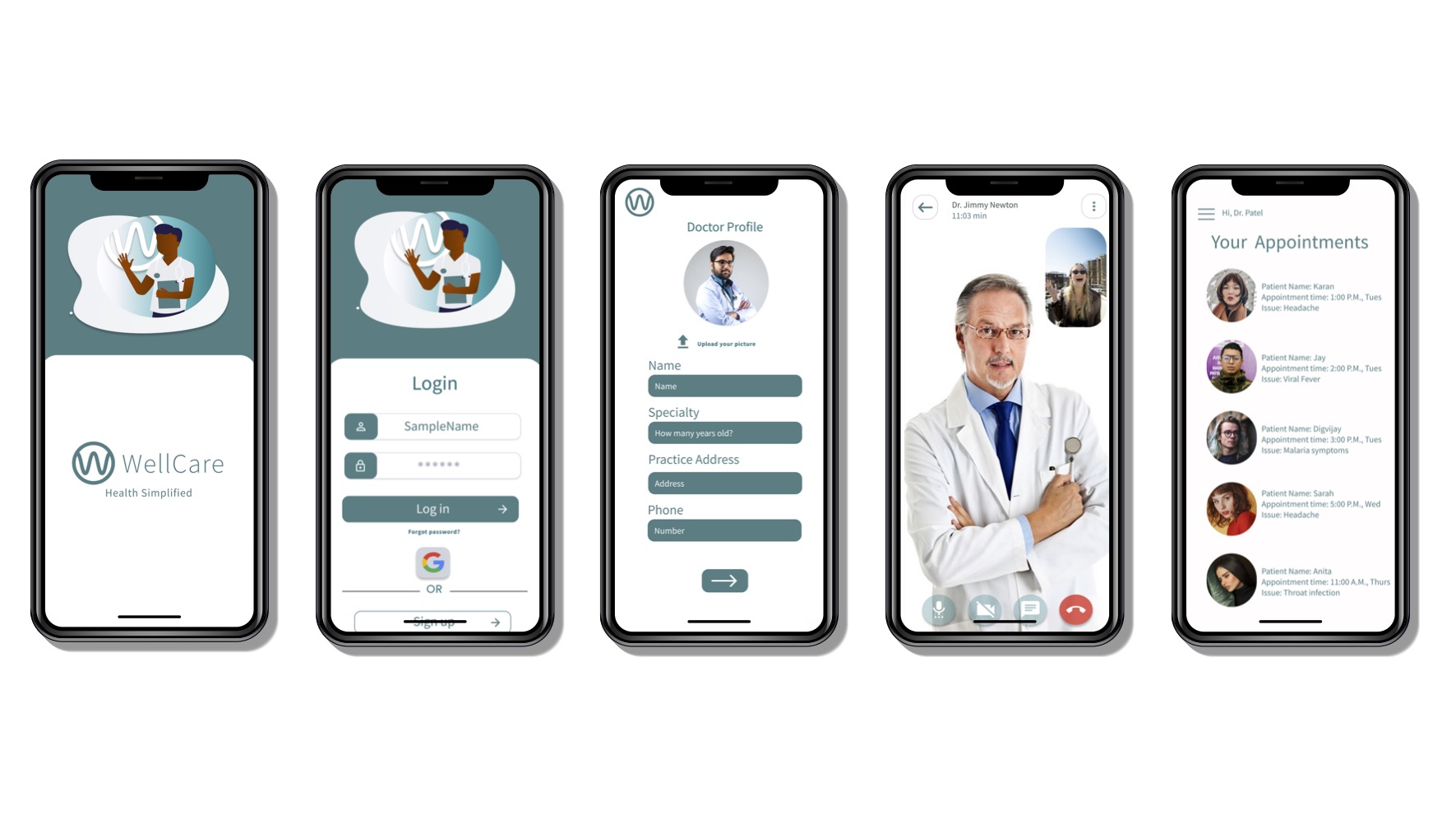
The purpose behind the doctor’s profile page in a healthcare app is to provide comprehensive and relevant information about the doctor to patients or other healthcare professionals.
Establishing Trust and Credibility: The doctor’s profile page should feature elements that establish trust and credibility. This can include displaying the doctor’s name, qualifications, certifications, and professional affiliations. Incorporate visual elements such as a professional photo to create a personal connection and foster confidence in the doctor’s expertise.
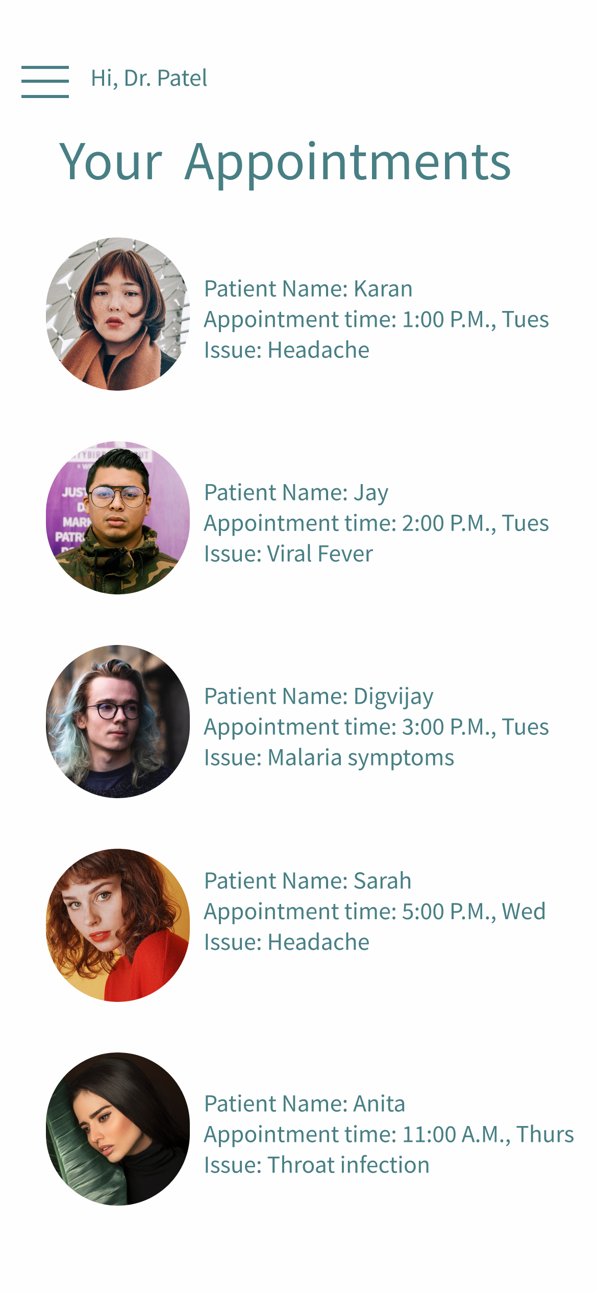
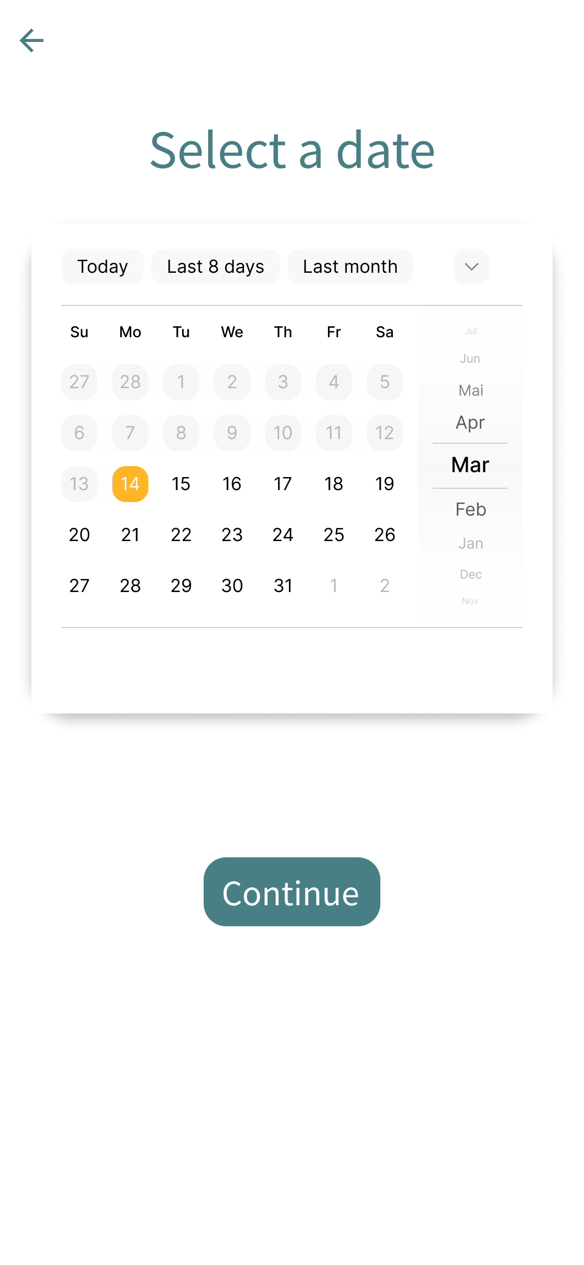
The doctor’s view of patients in a healthcare app should provide a comprehensive overview of their patients’ information, medical history, and ongoing treatment. The UI should support efficient data management and enable doctors to make informed decisions. Here’s an outline of the UI elements and their respective purposes:
Patient List: The UI should display a list of patients, including their names, profile pictures, and relevant summary information. This allows doctors to quickly identify and locate specific patients.
The patient list provides an organized and scannable overview of patients, enabling doctors to efficiently navigate and access individual patient profiles.

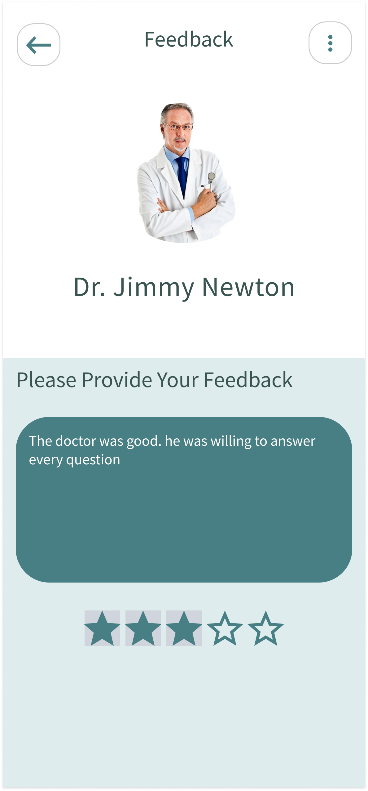
The patients’ view of available doctors aims to facilitate a seamless and informed selection process. It empowers patients to search, evaluate, and connect with healthcare providers that suit their preferences, enabling them to make confident decisions about their healthcare journey.
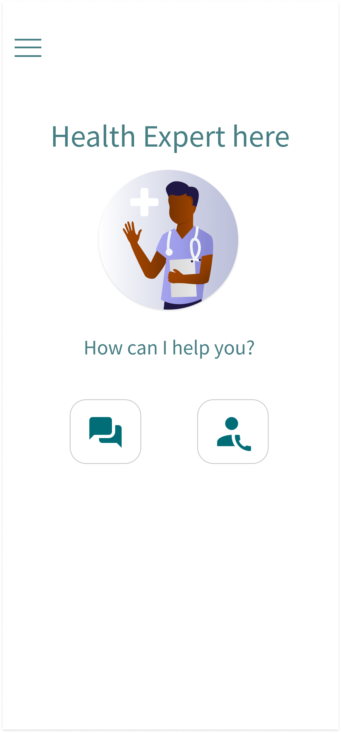
The inclusion of chat and video appointments enhances patient convenience and accessibility by providing seamless communication options, expanding reach, and offering flexible remote consultations. It enables visual engagement, and efficient information sharing, and ensures privacy and security, resulting in an improved overall patient experience.


Password Verification
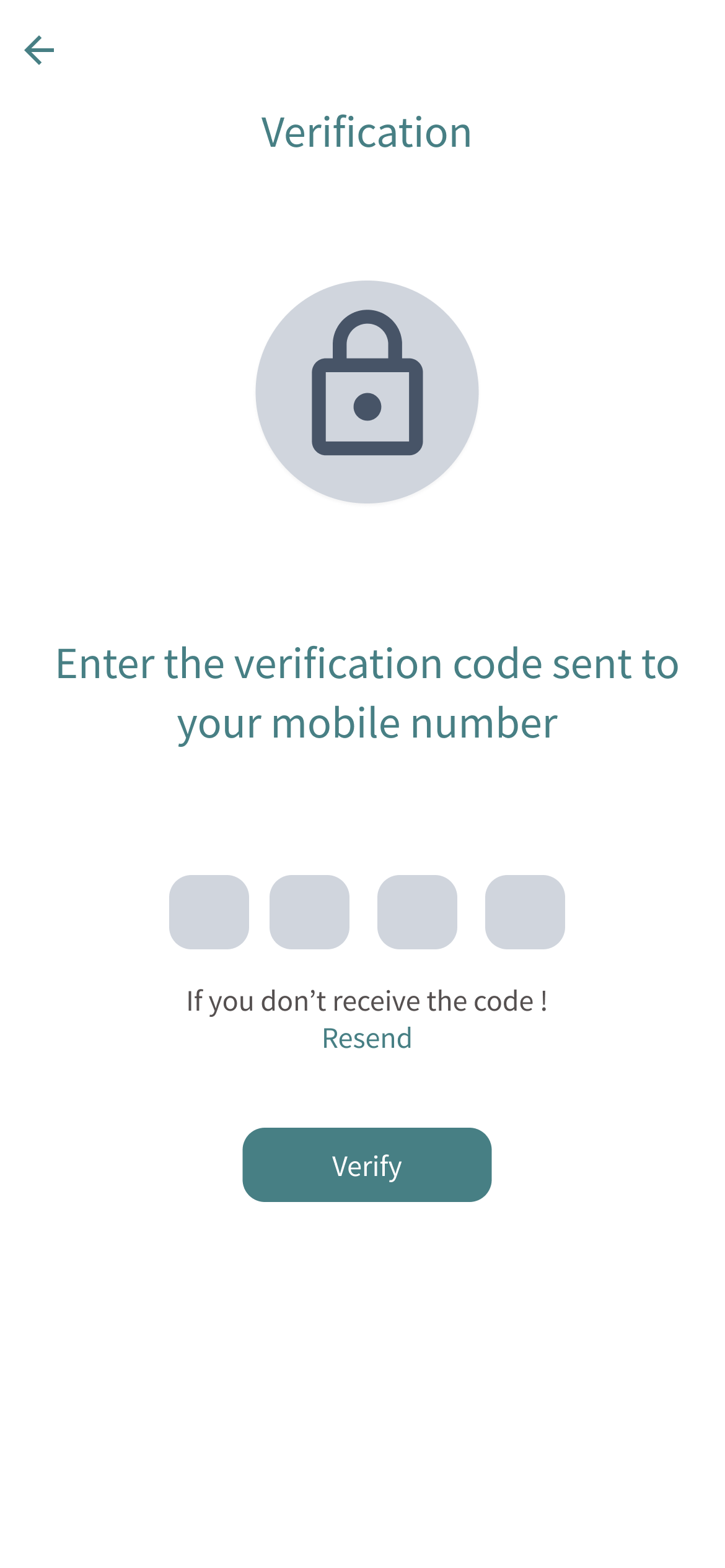
Closed Lock: When the password is not accessible or incorrect, the lock icon is gray, indicating restricted access.
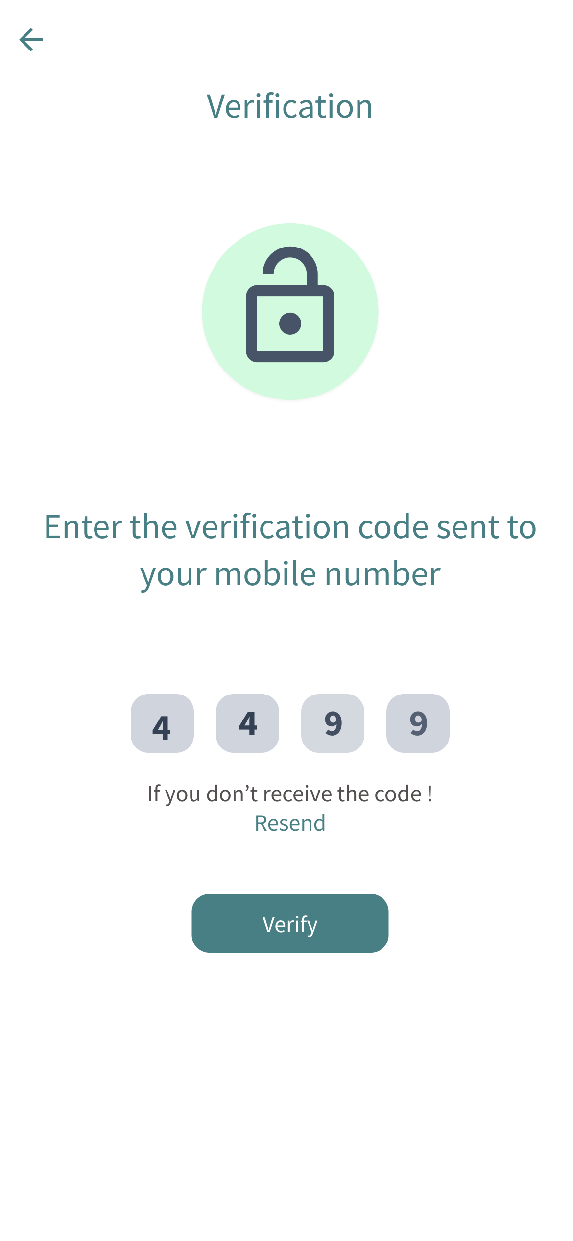
Unlocked Lock: Conversely, when the password is successfully reset or validated, the lock icon can be tinted with a green color, symbolizing a positive or successful state. This green tint provides a clear visual indication to the user that the password reset was completed successfully, and they now have access to the desired content.
Future Improvements
- Address privacy and security throughout the apps user interface by implementing secure authentication, prominently displaying the privacy policy and obtaining user consent, encrypting data transmission and storage, offering granular privacy controls, incorporating secure messaging with end-to-end encryption, anonymizing or de-identifying data, and ensuring compliance with privacy regulations. These measures protect patient data, promote user control, and build trust in the app’s privacy practices.
-
Addition of appointment reminders and notifications: The UI should include appointment reminder notifications for scheduled chat or video sessions. These notifications can be delivered through push notifications, emails, or in-app alerts to ensure that patients are aware of upcoming appointments and are prepared to join the sessions.
Accessibility Considerations
- Some accessibility considerations include providing alternative text for images to assist users with visual impairments, implementing clear and readable fonts, ensuring color contrast for users with visual challenges, offering keyboard navigation for users who cannot use a touchscreen, providing closed captions or transcripts for multimedia content, and designing an intuitive and user-friendly interface that accommodates users with varying levels of technological proficiency. By incorporating these accessibility considerations, the app becomes more inclusive and accessible to a wider range of users.
