The Product
The Product
The D.C., Maryland, and Virginia area is home to rich art culture. Living near such tourist attractions made me aware of the complexities and frustrations of navigating multiple art galleries to find the shows you may want. I spoke with users to learn what their experience in the art gallery space was like.
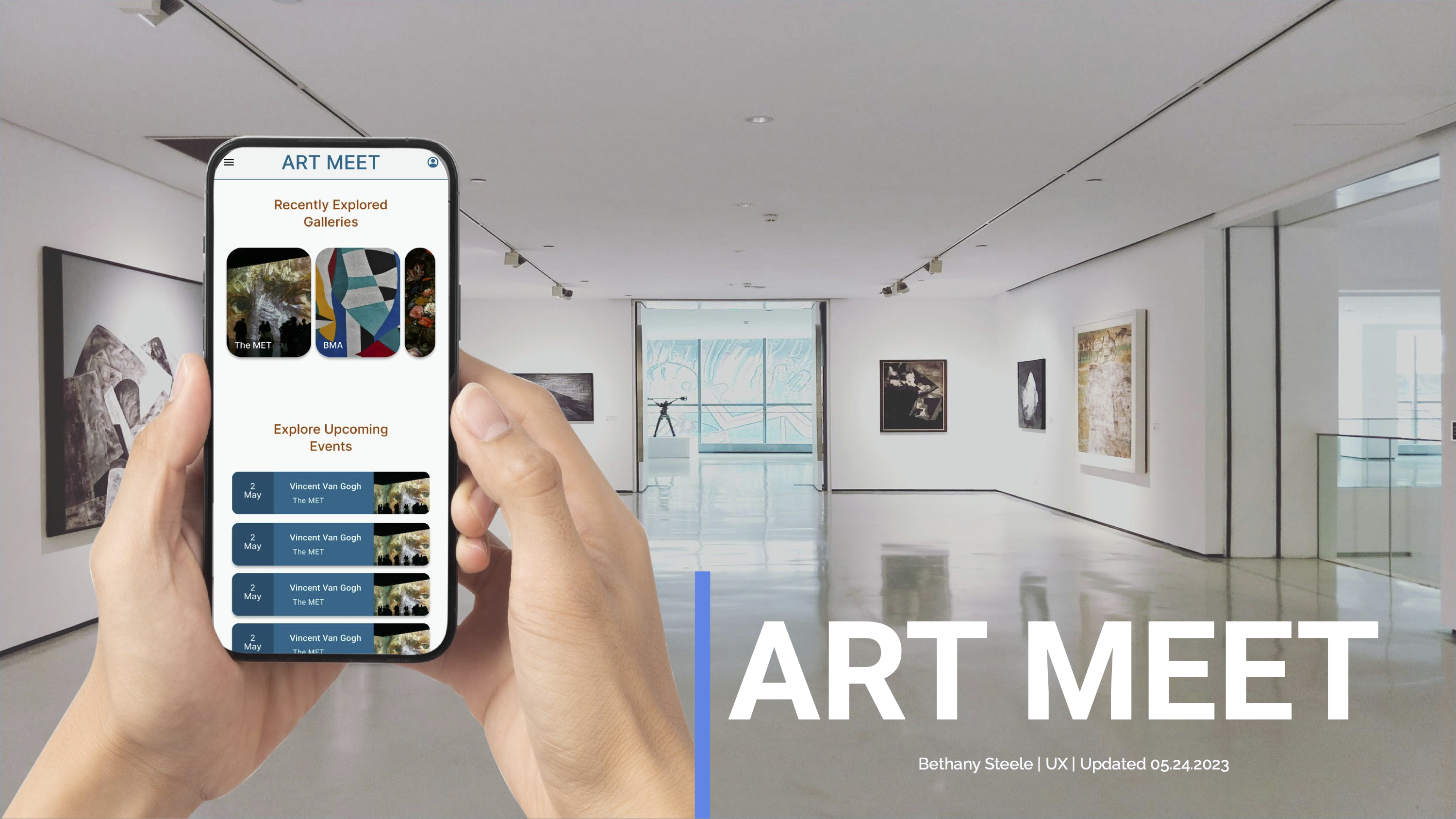
This mobile application called Art Meet provides information about live art events and allows users to purchase tickets, connect with others, and arrange visits.
Checkout User Flow Project Timeline March 2022 – August 2022
The D.C., Maryland, and Virginia area is home to rich art culture. Living near such tourist attractions made me aware of the complexities and frustrations of navigating multiple art galleries to find the shows you may want. I spoke with users to learn what their experience in the art gallery space was like.
This mobile application called Art Meet provides information about live art events and allows users to purchase tickets, connect with others, and arrange visits.
Project Timeline March 2022 – August 2022

The Problem
For those who are busy, visiting multiple art galleries can be challenging due to limited time to search various websites for information on times, genres, and events.
The Goal
Provide users with a mobile application that allows them to quickly purchase tickets, search for events, and save potential events. App users should be able to purchase tickets immediately since the application can be used on the go.
High Fidelity Prototype
High Fidelity Prototype

Takeaways
- In the usability study users noted that the prototype elements were placed in areas that users were not able to easily locate without scrolling.
- After 3 iterations to address the friction created by the original placement of elements, the user flow was improved
- Qualitative reviews of the recent iteration demonstrated an improved user interface and user experience.
“It was straightforward and easy to navigate.”
Research
- I conducted 3 user interviews to discuss their interactions with art galleries in their communities.
- One common frustration was the difficulty in scheduling a time to visit favorite galleries.
- By reviewing user comments and the user experience of the National Gallery of Art and The MET I identified areas of improvement.
- I developed an art gallery-specific app based on user feedback where the search features are similar to other ticket-purchasing apps so that users can have reduced friction in achieving their goal of attending galleries.
- As users primarily conduct searches on their phones, this is a mobile web app.
Hi-Fi Prototype User Checkout Flow
Take Aways
- In the usability study users noted that the prototype elements were placed in areas that users were not able to easily locate without scrolling.
- After 3 iterations to address the friction created by the original placement of elements, the user flow was improved
- Qualitative reviews of the recent iteration demonstrated an improved user interface and user experience.
Research
- I conducted 3 user interviews to discuss their interactions with art galleries in their communities.
- One common frustration was the difficulty in scheduling a time to visit favorite galleries.
- By reviewing user comments and the user experience of the National Gallery of Art and The MET I identified areas of improvement.
- I developed an art gallery-specific app based on user feedback where the search features are similar to other ticket-purchasing apps so that users can have reduced friction in achieving their goal of attending galleries.
- As users primarily conduct searches on their phones, this is a mobile web app.
Competitive Audit
National Gallery of Art
It has a vibrant, colorful interface and a great mobile experience. The amount of information is overwhelming and it takes several scrolls to reach the event details.
Metropolitan Museum of Art
The MET has an easy-to-navigate user interface. This design uses red and gray in a non-distracting manner. Additionally, the events section includes important information and directions about what to bring. It is only available for MET events.
Smartify and Art Guide
The focus of Smartify is on the artwork itself. Accessibility is improved by placing the image first. The app’s focus on images can make navigating it a little confusing. It is not possible to search for works based on their location.
“I enjoy visiting museums but want to better connect with the artist and have an exciting experience.”
![]()
Persona

Ellen
She is a 25-year-old working professional in a new city looking for a simple way to book tickets to attend live art events because she does not have time to individually search each gallery’s website for upcoming events.
Goals
- Engage new artists and exhibits
- Seeks exciting interactive museum experiences
- Looking to connect with like-minded people.
Frustrations
- “Art displays can be confusing and disconnected from the artist”
- “ museums can be boring and complicated to navigate”
Age: 25
Education: Bachelor’s Degree
Hometown: Washington D.C.
Family: Single
Occupation: Early career in design
Personas

Ellen
is a 25-year-old working professional in a new city looking for a simple way to book tickets to attend live art events because she does not have time to individually search each gallery’s website for upcoming events.
Goals
- Engage new artists and exhibits
- Seeks exciting interactive museum experiences
- Looking to connect with like-minded people.
Frustrations
- “Art displays can be confusing and disconnected from the artist”
- “ museums can be boring and complicated to navigate”
Age: 25
Education: Bachelor’s Degree
Hometown: Washington D.C.
Family: Single
Occupation: Early career in design
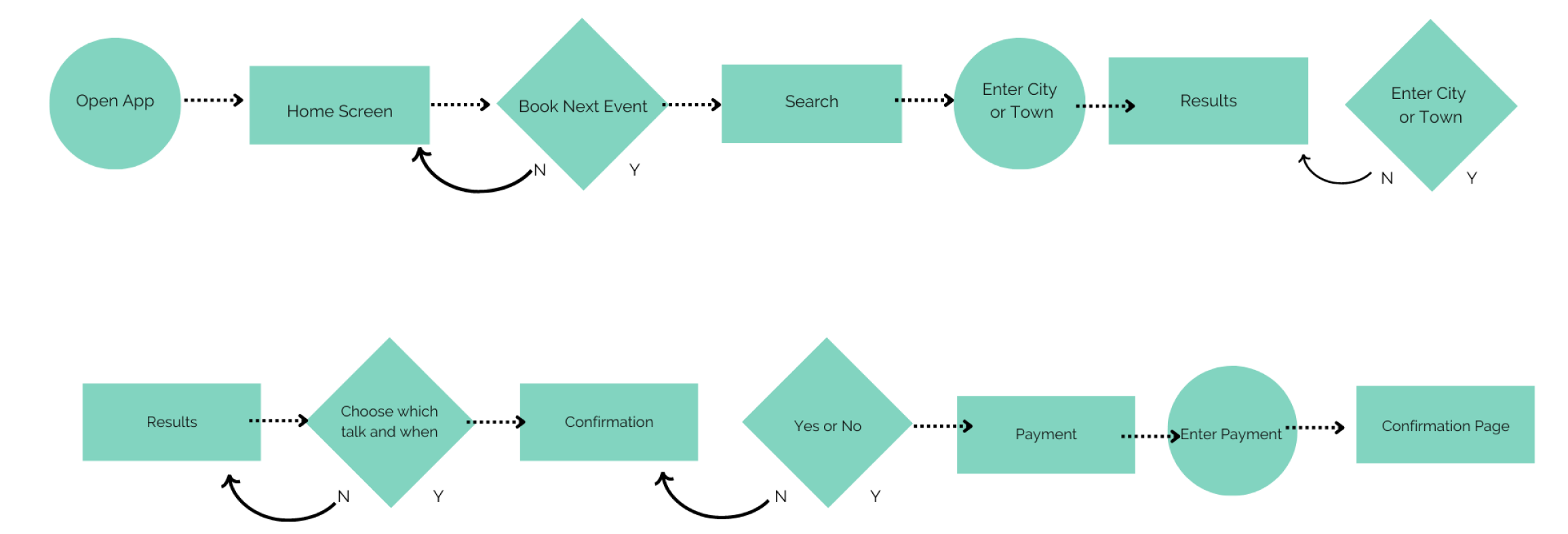
Ticket Purchase User Flow
Usability Study Findings
These are the areas of improvement identified in the low and high-fidelity usability prototypes.
Usability Study Findings
These are the areas of improvement identified in the low and high-fidelity usability prototypes.
Round 1
- It was difficult to find the “next” button when purchasing
- Users were unsure when they completed the ticket purchase flow
- Finding the events section was easy
Round 2
- One user wanted to add a share button
- One user wanted to Include a Map
- Users found the buying process simple and straightforward
Survey Pain Points
Pain
Users are too busy to search multiple sites to find art gallery events.
Pain 2
Users want access to multiple locations and genres to find events that fit their personal tastes.
Pain 3
Users want the ability to search based on low or high crowd volume which is not currently supported on apps.
Page Design
Page Design for User Check Out User Flow
Home
The Home page features card style layout with upcoming events which are influenced by location. It also features a chat and news section to allow multiple ways to see upcoming events and gauge interest.
Event SERP
The Event page features card-style listings with a filter at the top. Users can narrow down results by time, date, location, event type, and more. Each card gives the name of the event, date, and location to make skimming easy.
The Event Details
When users select an event a page opens with more details on the event similar to other apps users can review a synopsis and decide to tap buy the ticket. They can also share the event with friends or save it to continue browsing.
Check out
On the checkout, page users focus on confirming the event and the number of tickets they may want. The checkout pages are a sequential process to reduce cognitive load at checkout. Users can go back to the previous page or home page easily if they change their minds.
Checkout Confirmation
The Checkout confirmation page is where users enter payment information and contact information. Users can verify their total before hitting confirm. The quantity of tickets is indicated by the shopping cart icon with a circle highlighting the quantity represented by a number.
Successful Payment Page
The successful payment page confirms the payment worked and it confirms the quantity and location again as well. The page also includes a home button so users can return to the beginning after their purchase.
Home
The Home page features card style layout with upcoming events which are influenced by location. It also features a chat and news section to allow multiple ways to see upcoming events and gauge interest.
The Event Details
The Event page features card-style listings with a filter at the top. Users can narrow down results by time, date, location, event type, and more. Each card gives the name of the event, date, and location to make skimming easy.
Event Results Page
When users select an event a page opens with more details on the event similar to other apps users can review a synopsis and decide to tap buy the ticket. They can also share the event with friends or save it to continue browsing.
Check Out
On the checkout, page users focus on confirming the event and the number of tickets they may want. The checkout pages are a sequential process to reduce cognitive load at checkout. Users can go back to the previous page or home page easily if they change their minds.
Checkout Confirmation
The Checkout confirmation page is where users enter payment information and contact information. Users can verify their total before hitting confirm. The quantity of tickets is indicated by the shopping cart icon with a circle highlighting the quantity represented by a number.
Successful Payment Page
The successful payment page confirms the payment worked and it confirms the quantity and location again as well. The page also includes a home button so users can return to the beginning after their purchase.
Revisiting the Process
- I decided to revisit the app to update it to Google’s Material 3 Design System
- This system streamlines the process of producing prototypes and is based on user testing
Revisiting The Process
- I decided to revisit the app to update it to Google’s Material 3 Design System
- This system streamlines the process of producing prototypes and is based on user testing
Establishing a Design System
Icons, cards, carousels, and other components were adapted to the Material Design system to improve user flow by increasing information access via horizontal carousels and condensed simplified cards, along with the use of shadow to create elevation.
Establishing a Design System
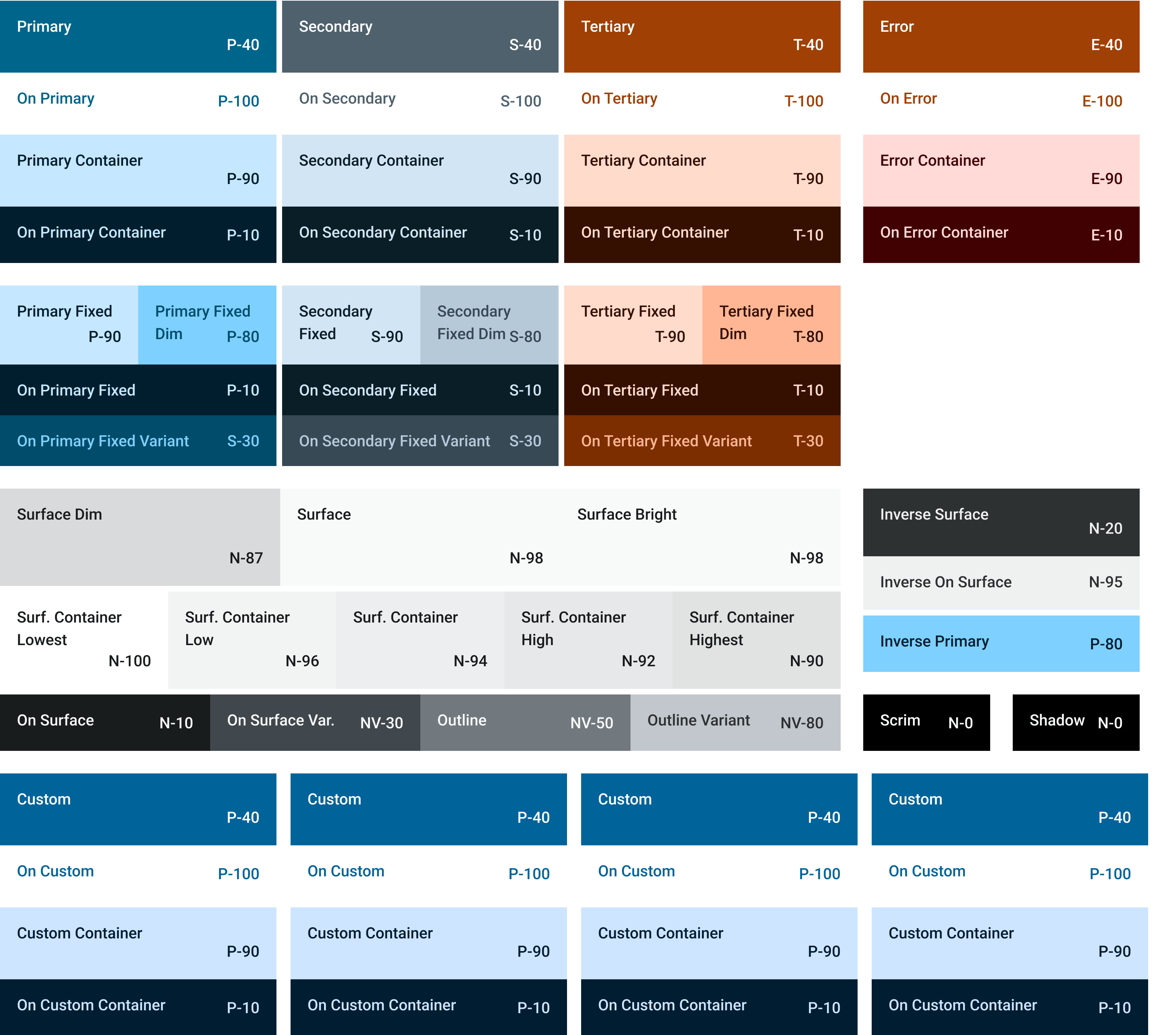
The color palette was updated to ensure AA passing contrast across the app.

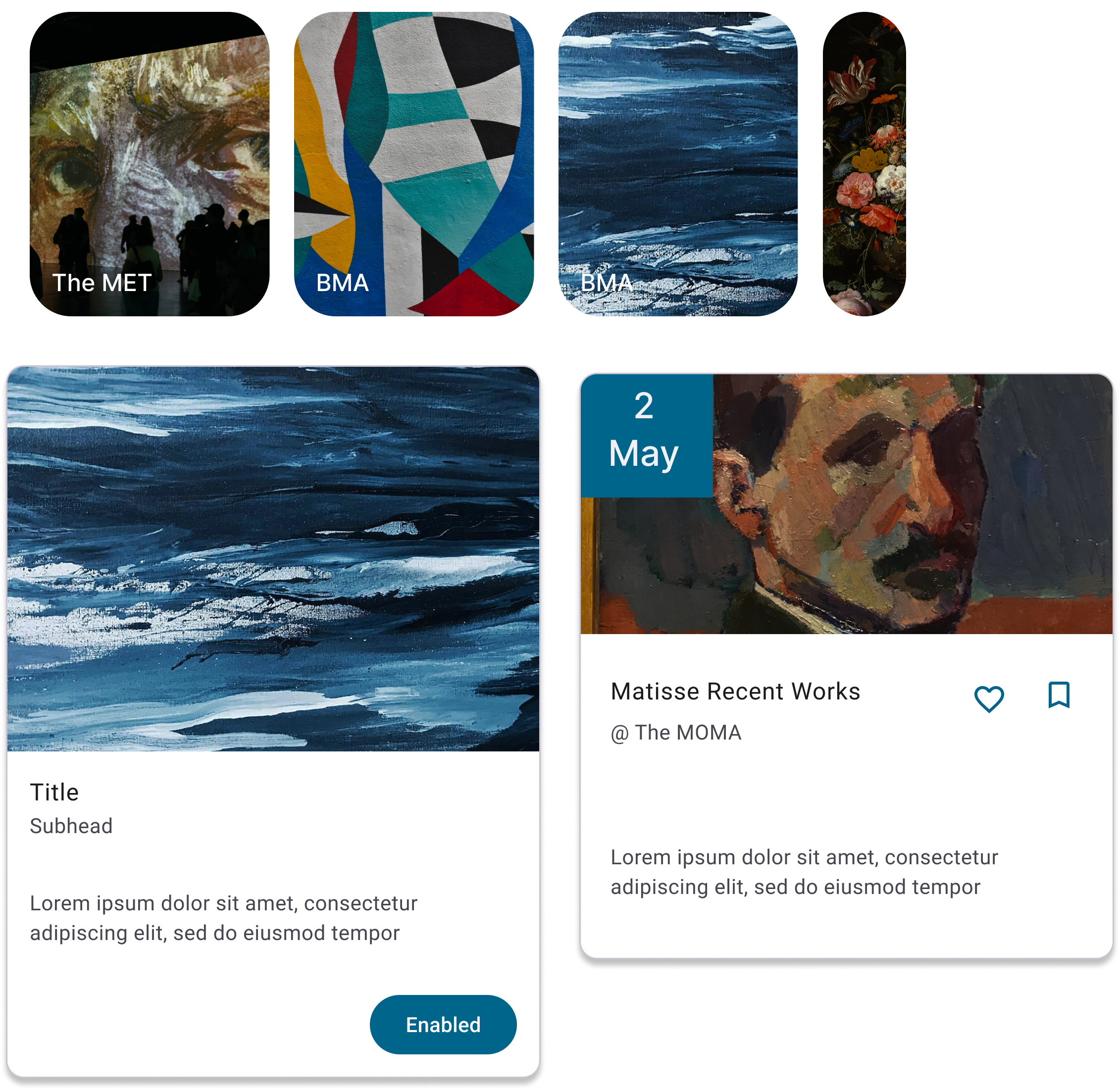
Icons, cards, carousels, and other components were adapted to the Material Design system to improve user flow by increasing information access via horizontal carousels and condensed simplified cards, along with the use of shadow to create elevation.

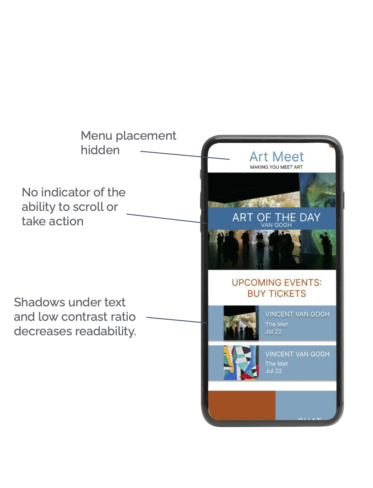
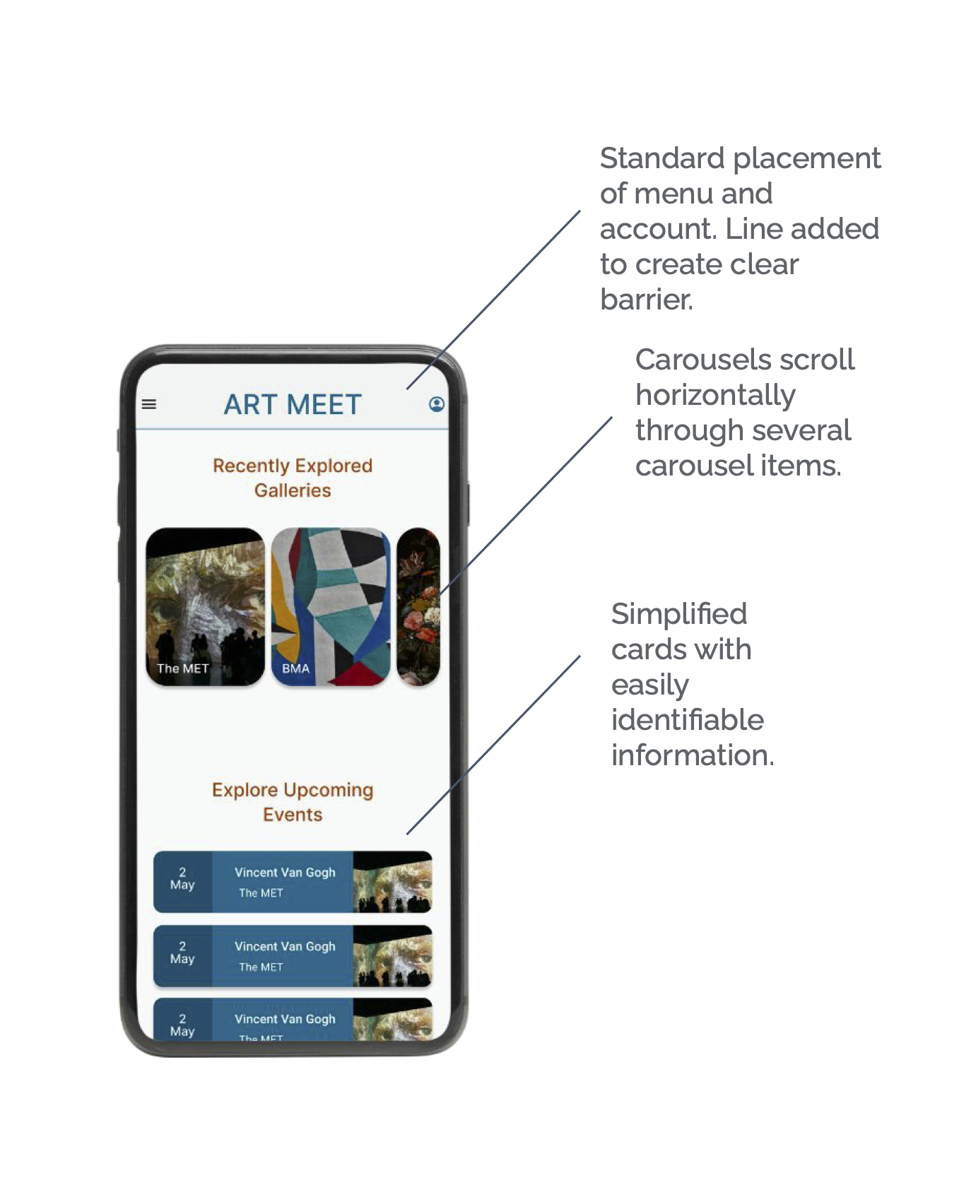
Updated Home Screen
The header was updated to be standardized across all screens to ease navigation. Horizontal scrolling was added to increase access to information above the fold of the home screen.
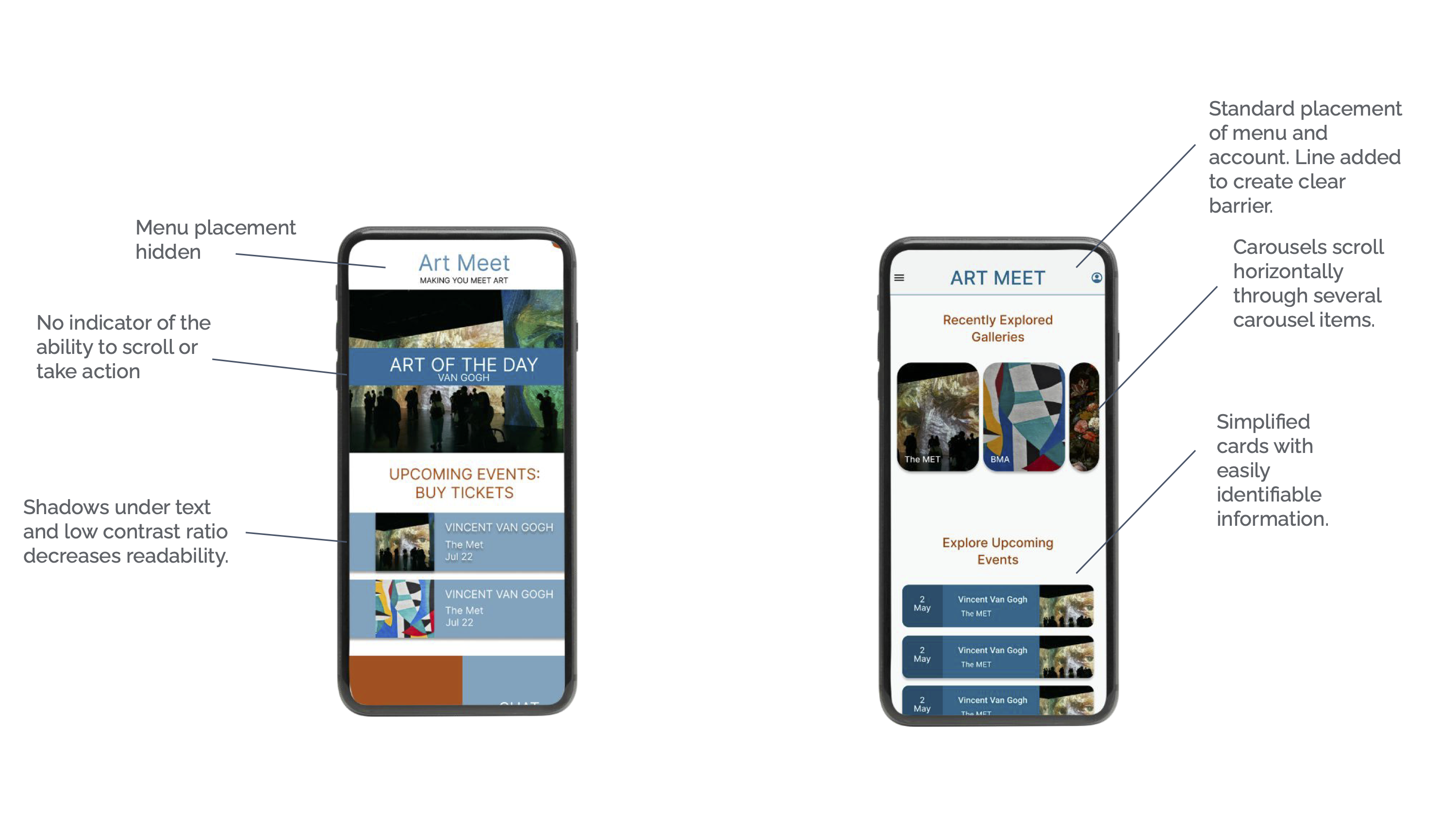
Updated Home Screen
The header was updated to be standardized across all screens to ease navigation. Horizontal scrolling was added to increase access to information above the fold of the home screen.
Updated Event Search Result Page
I updated the cards on the SERP to include more details about each event. I also used elevation with shadows to create contrast from the background instead of contrasting color which reduces cognitive load and allows more information to be accessible.

Updated Event Result Page
I updated the cards on the SERP to include more details about each event. I also used elevation with shadows to create contrast from the background instead of contrasting color which reduces cognitive load and allows more information to be accessible.


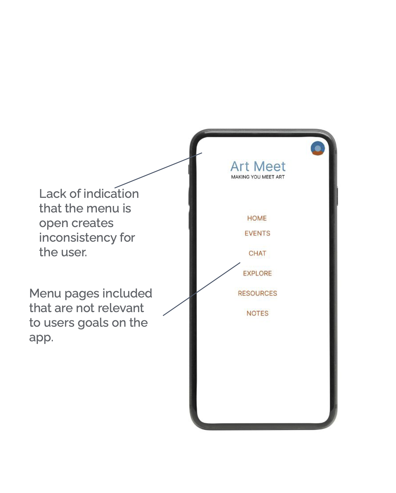
Updated Menu
The Menu was simplified to focus on the user’s end goals of purchasing and browsing for event tickets.
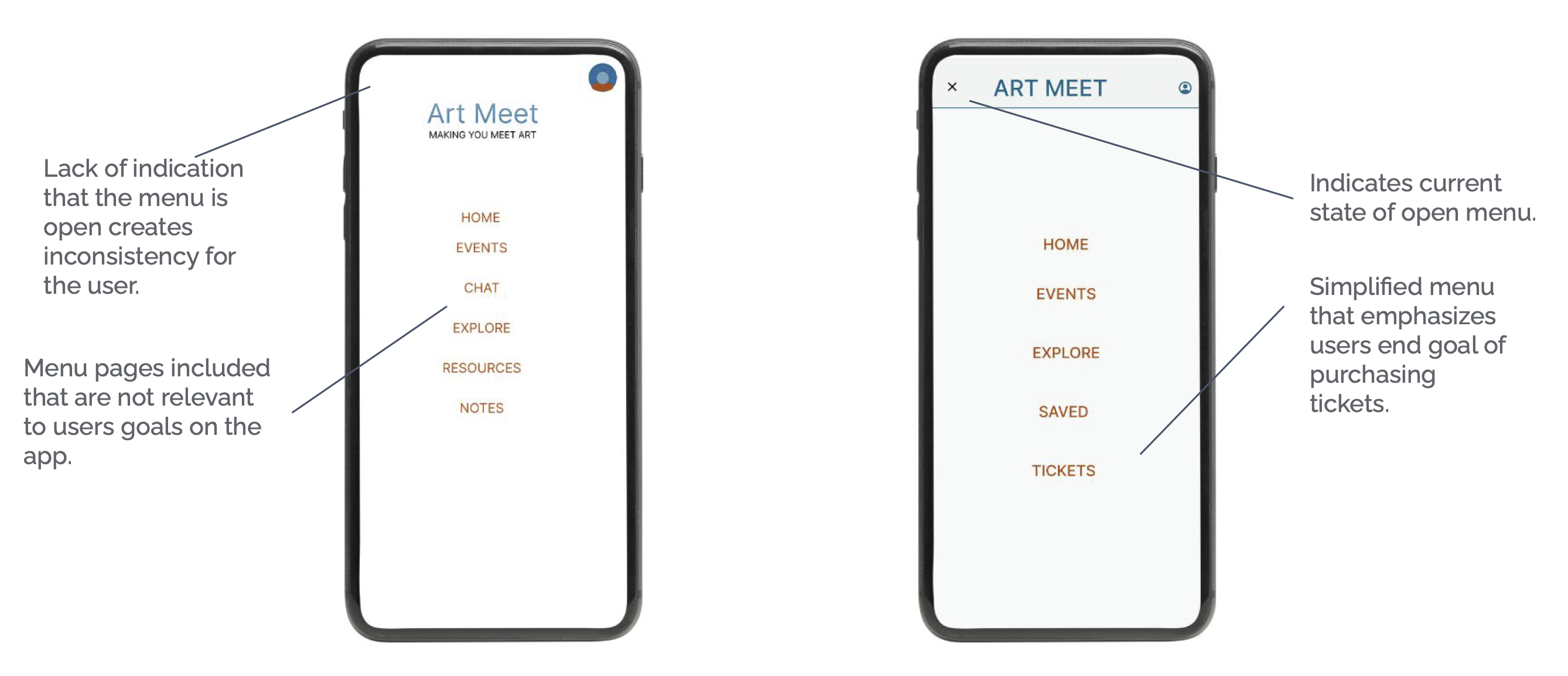
Updated Menu
The menu was simplified to focus on the user’s end goals of purchasing and browsing for event tickets.

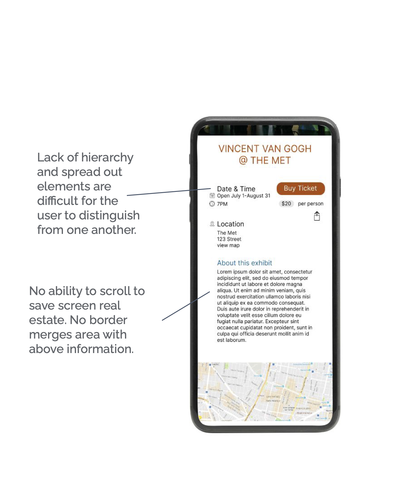
Updated Event Details
The event detail page was updated by focusing on creating a hierarchy through text and color to clearly indicate what the user can accomplish on the page.
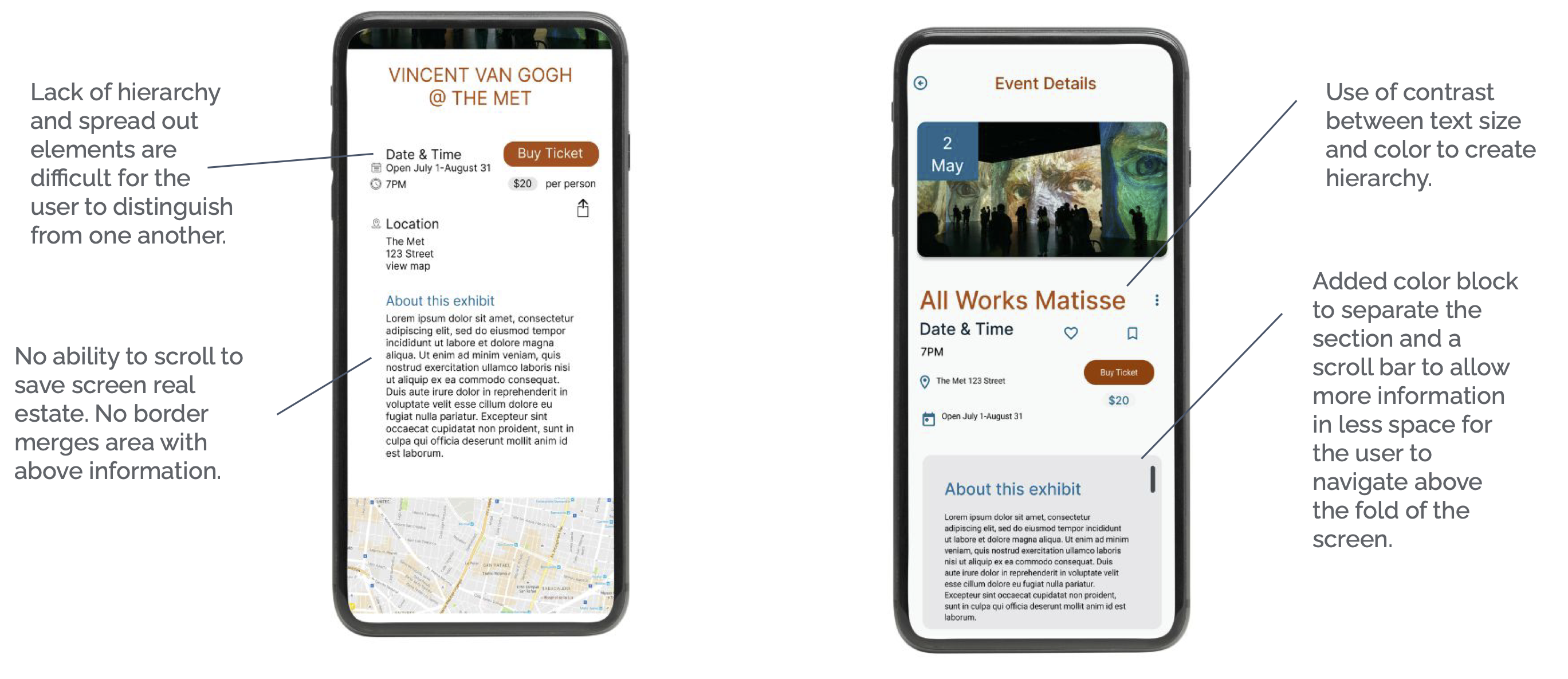
Updated Event Details
The event detail page was updated by focusing on creating a hierarchy through text and color to clearly indicate what the user can accomplish on the page.

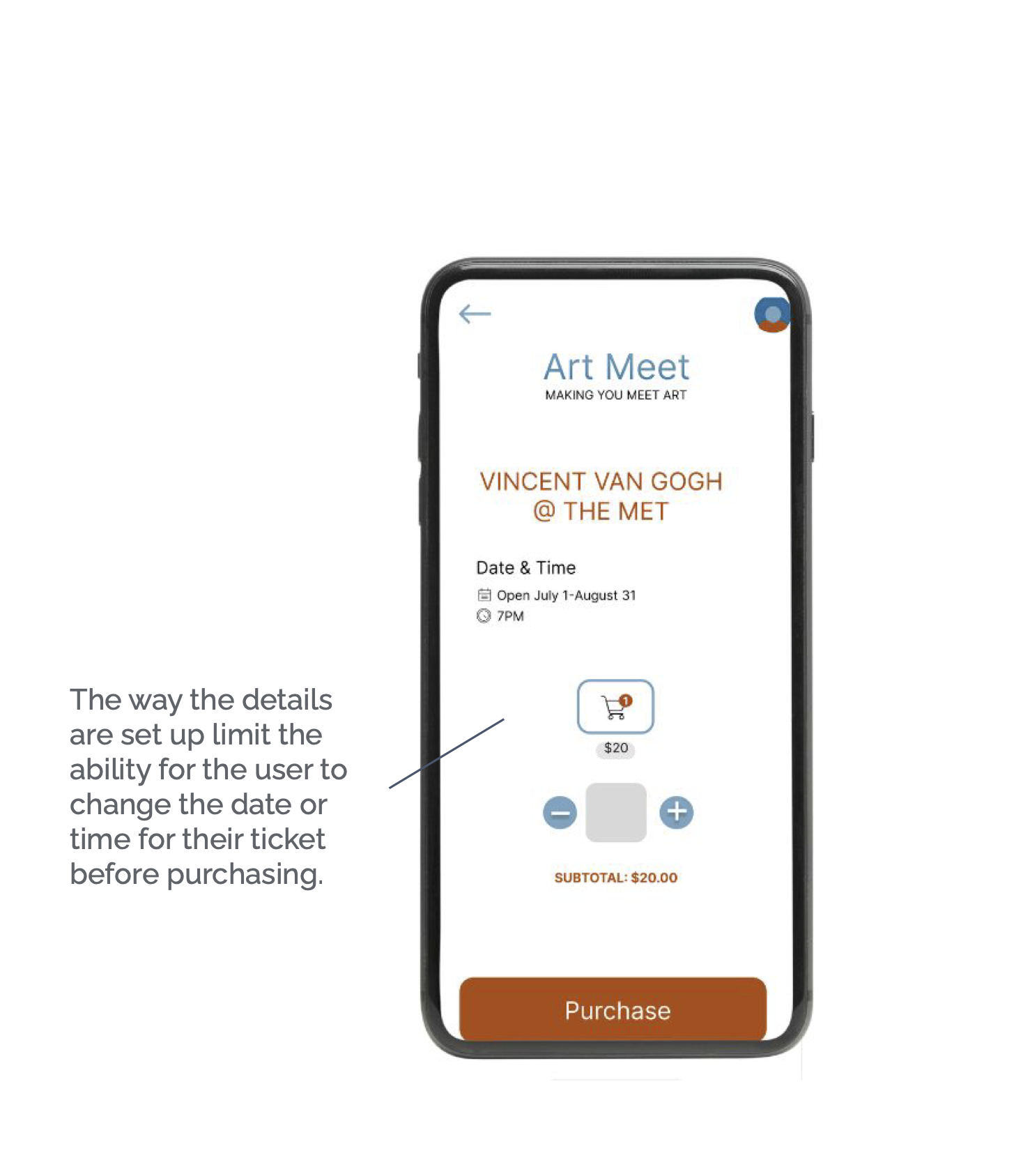
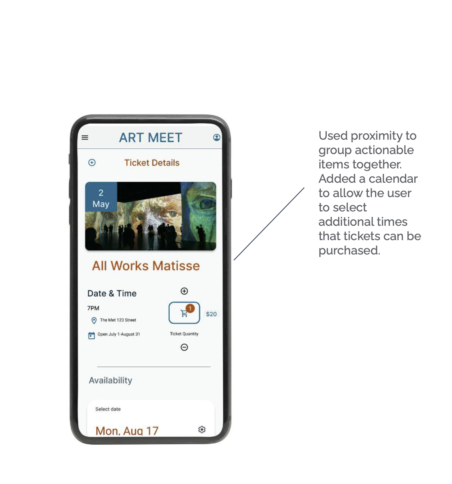
Updated Ticket Details
On the ticket details page, I utilized proximity and dividers to add options for the user without increasing the cognitive load with a visually busy user interface.
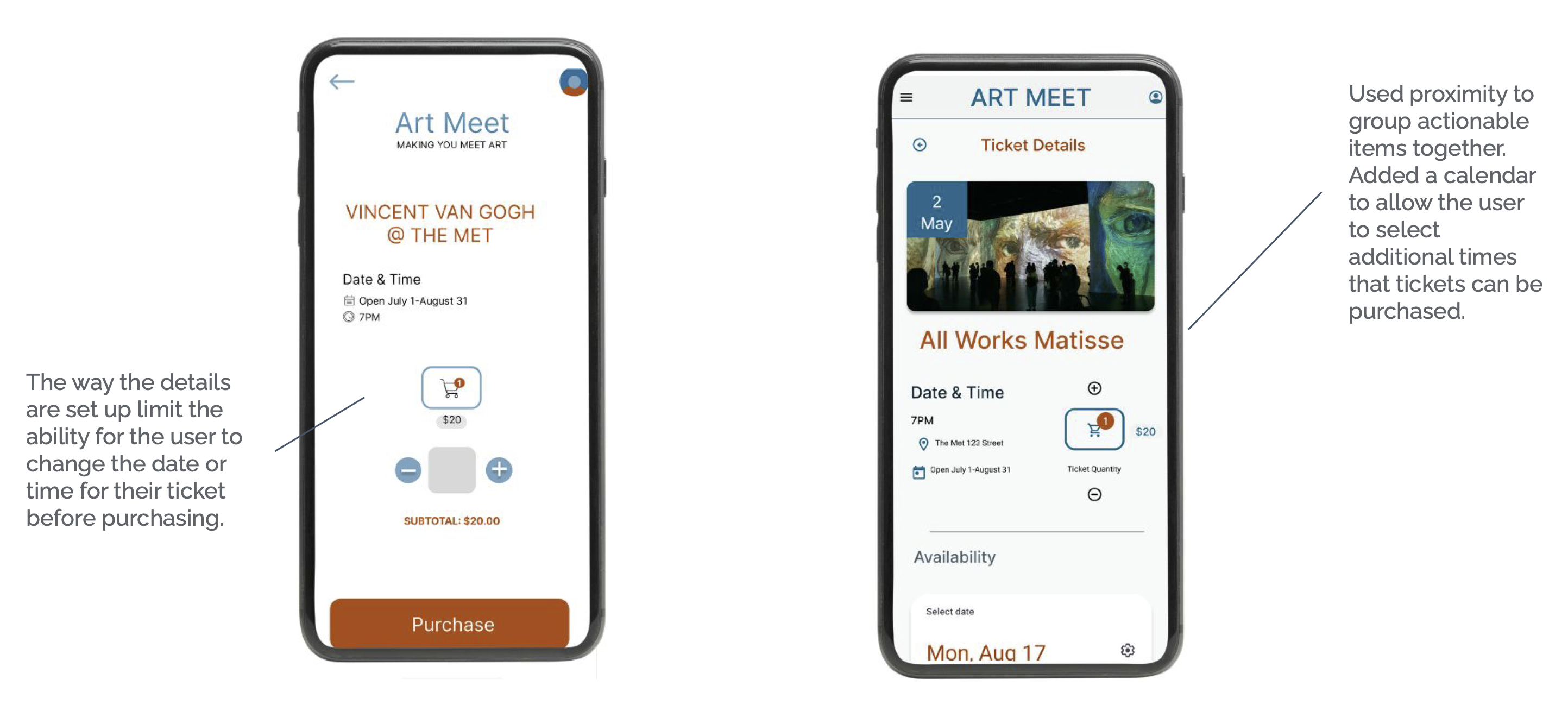
Updated Ticket Details
On the ticket details page, I utilized proximity and dividers to add options for the user without increasing the cognitive load with a visually busy user interface.
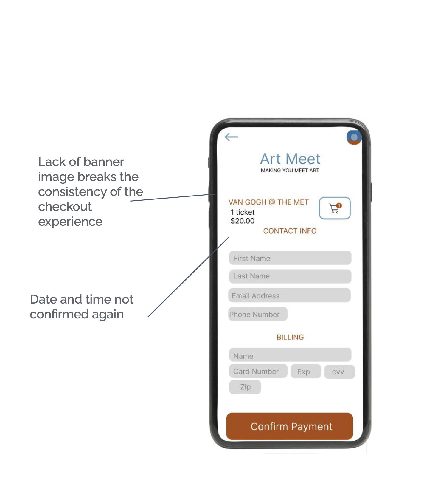
Updated Payment Screen
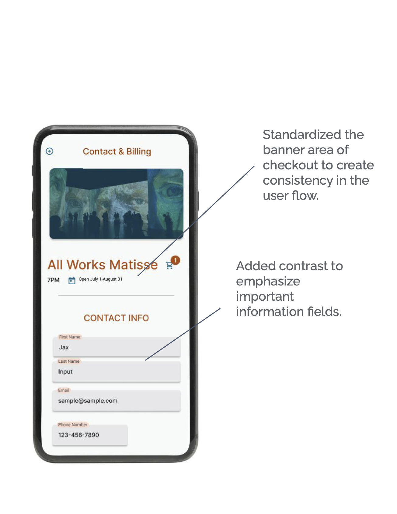
The payment screen was updated to include a consistent banner area. The billing area had its language clarified so the user knows exactly what total they are paying for.
Updated Payment Screen
The payment screen was updated to include a consistent banner area. The billing area had its language clarified so the user knows exactly what total they are paying for.

Updated Successful Purchase Screen
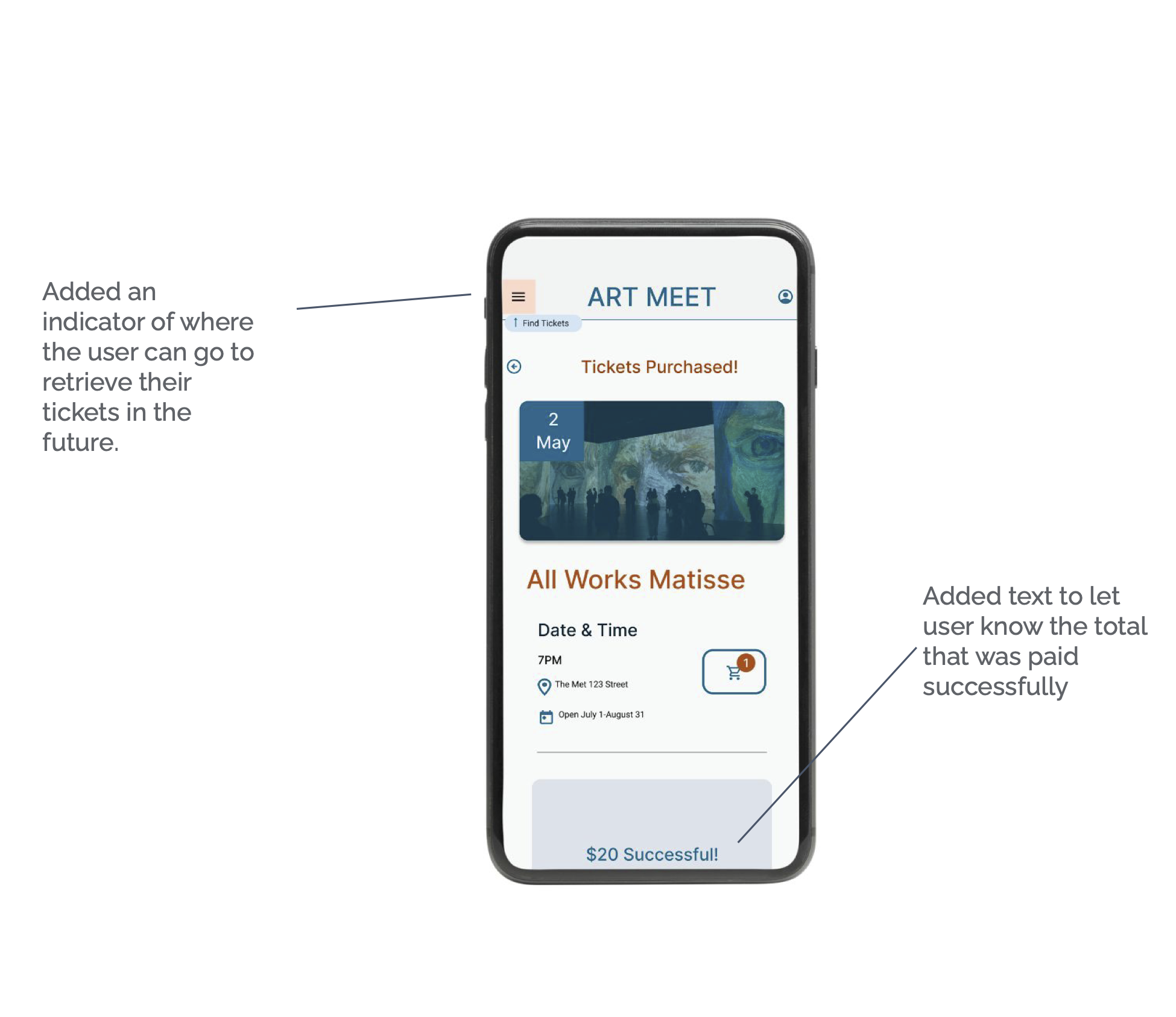
The successful purchase page was updated to add directions for the user to find their ticket purchase. It also specifies the amount of money paid.

Updated Successful Purchase Screen
The successful purchase page was updated to add directions for the user to find their ticket purchase. It also specifies the amount of money paid.
Accessibility
- Organized headers to be easy to navigate for a screen reader
- Use icons to simplify navigation
- Add alt text to images to ensure access to visually impaired users
- High Contrast mode
- Ability to filter for wheelchair-accessible galleries
- Ability to filter for an audio tour guide for hard-of-hearing users.
Moving Forward
- Complete an additional usability test with the updated UI
- Wireframe the additional pages for the app
- Add micro animation for transitions
Moving Forward
- Complete an additional usability test with the updated UI
- Wireframe the additional pages for the app
- Add micro animation for transitions
